Browse This: The Evolution of Film Stocks
Even as the internet rots our collective brain with politically irresponsible conspiracy theories and confusion about whether or not hot dogs are sandwiches (they are), it also plays host to some pretty remarkable resources, such as Barbara Flueckiger’s database, Timeline Of Historical Film Colors. This site is a great place to dive in and learn about color in film – both still images and moving pictures. The science is interesting, and the exemplary images of different color processes are gorgeous to behold.
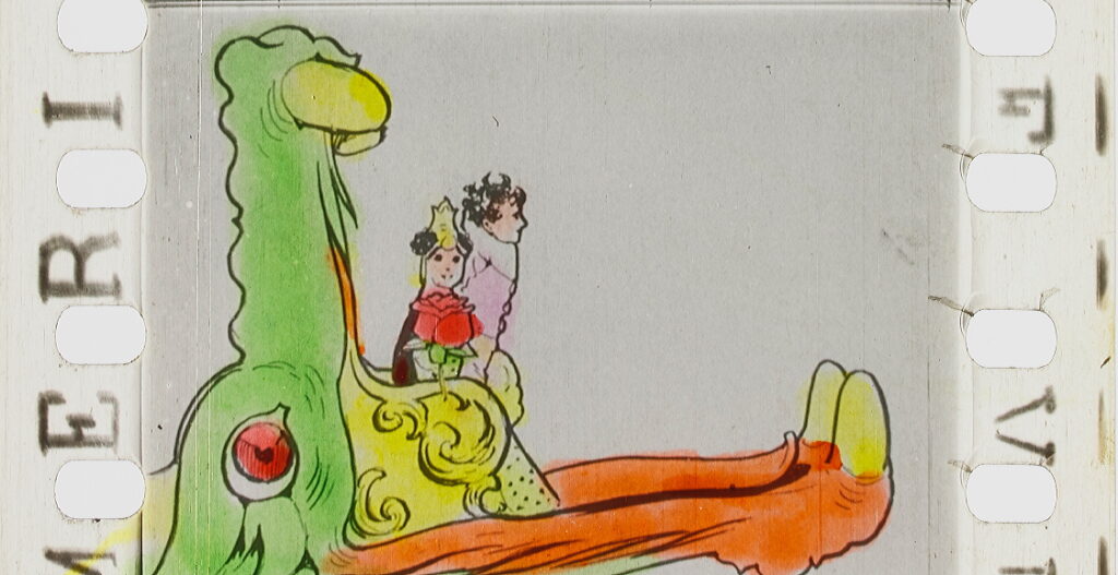
Here are a few examples. The first is a hand-colored frame from Winsor McKay’s 1911 film version of his Little Nemo In Slumberland strip. Each frame was painted by hand.
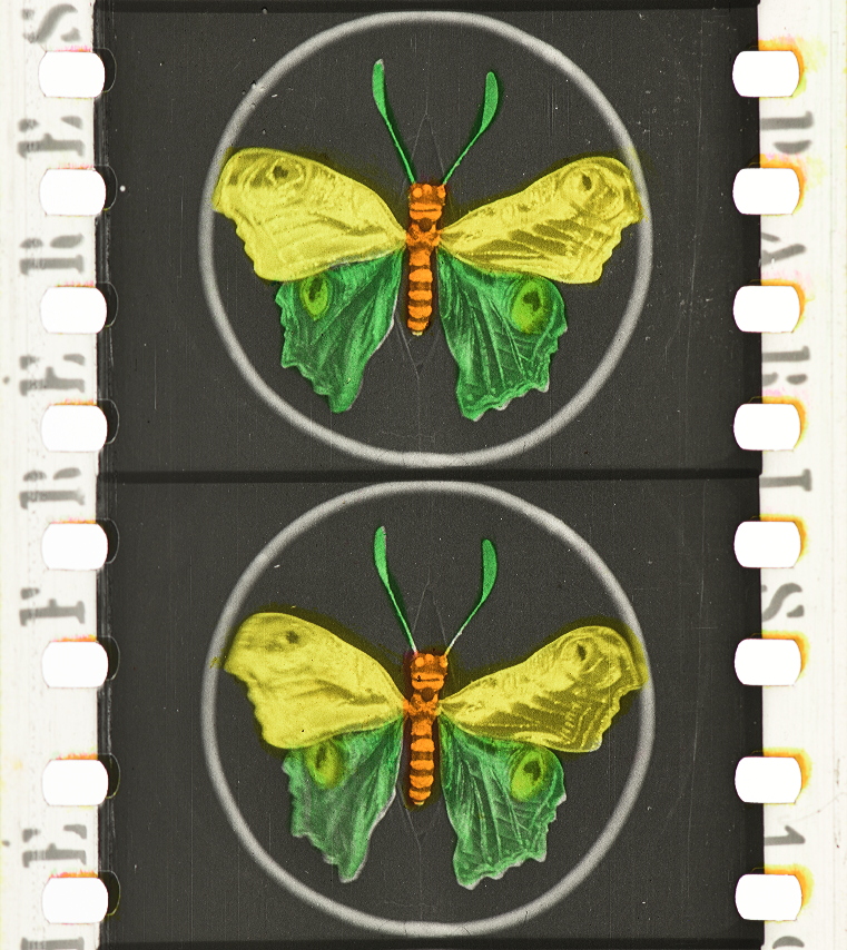
Here’s a frame from La peine du talion (FRA 1906, Gaston Velle; Albert Capellani)
The frame is colored but it is done by a stencil, giving it sharper lines.
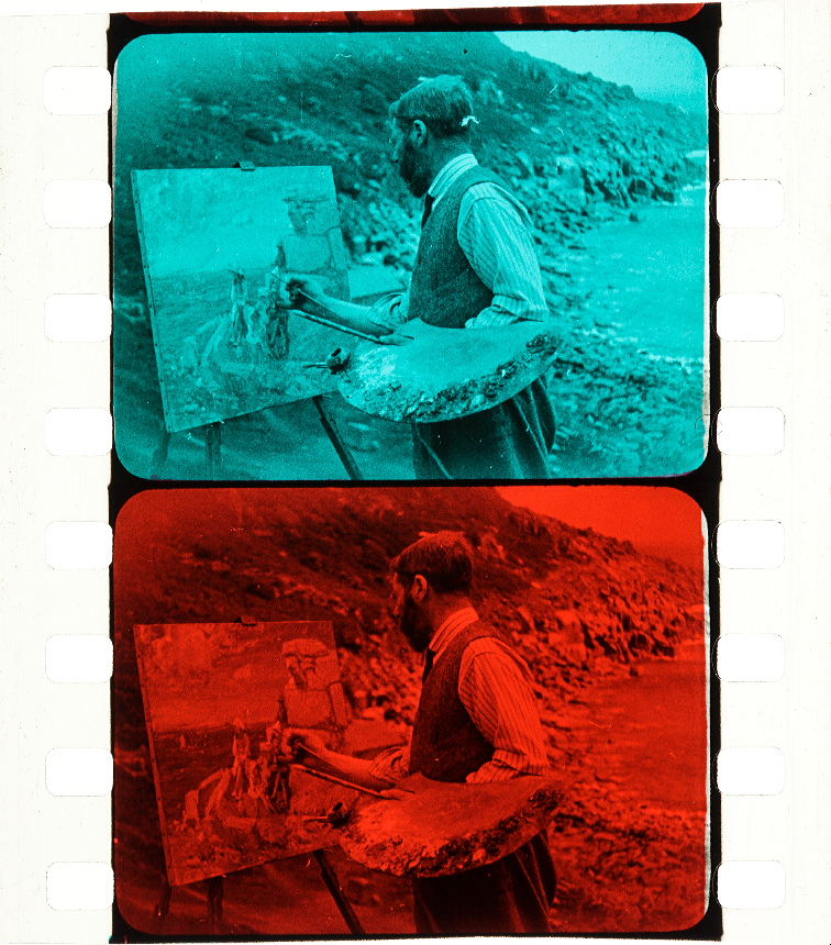
Here, two subsequent frames are stained with different colored dye, put it together and you sort of get an impression of vivid color:
The Open Road (GBR 1925, Claude Friese-Greene)
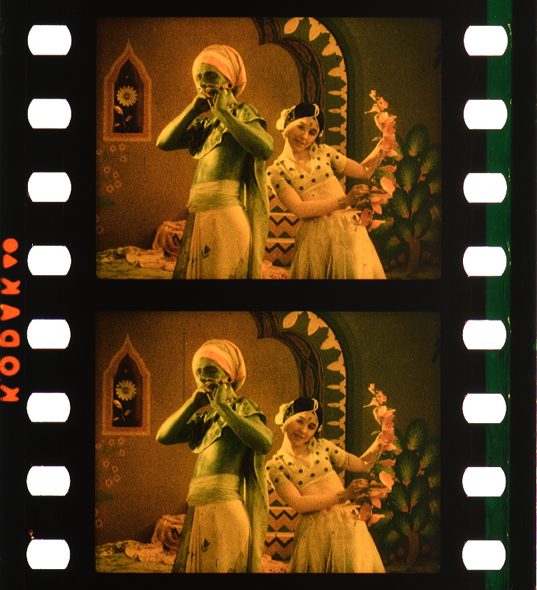
The two color Kodachrome process used a process of tanning and treating the film stock before applying dyes.
The Flute of Krishna (USA 1926, Eastman Kodak)
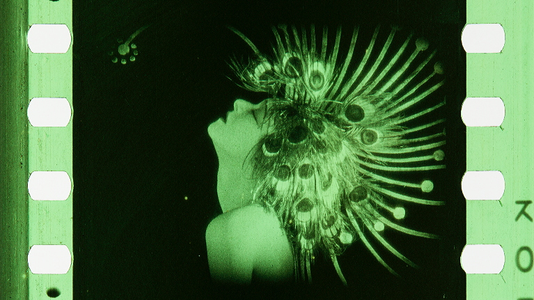
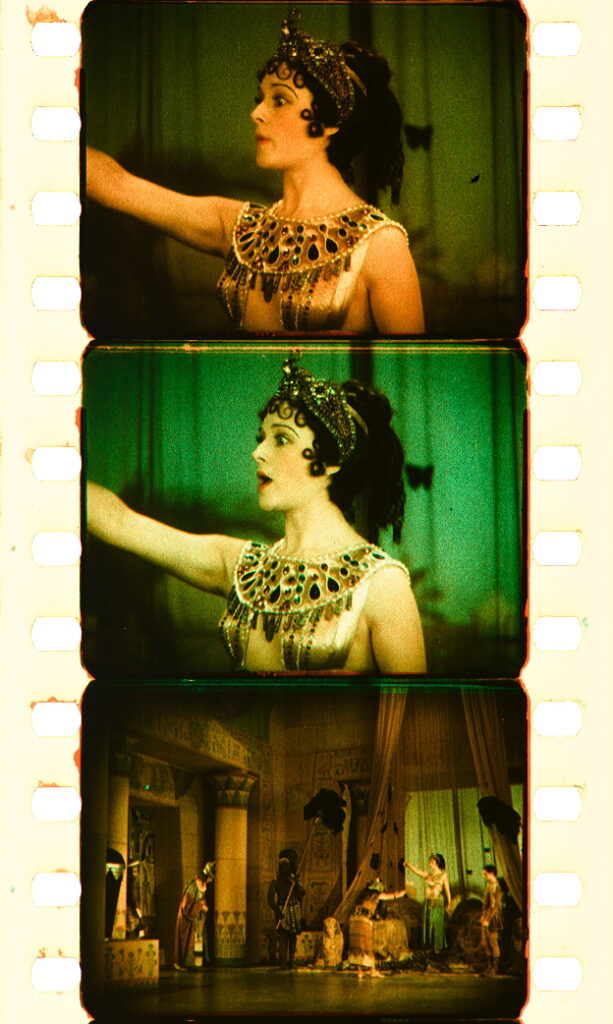
Next, we encounter subtractive two-strip Technicolor. in which dye imbibition is used to transfer red and green data to a black and white positive frame.
Cleopatra (USA 1928, Roy William Neill)
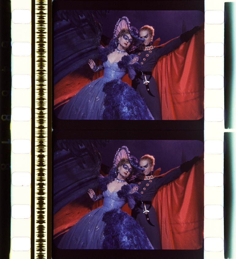
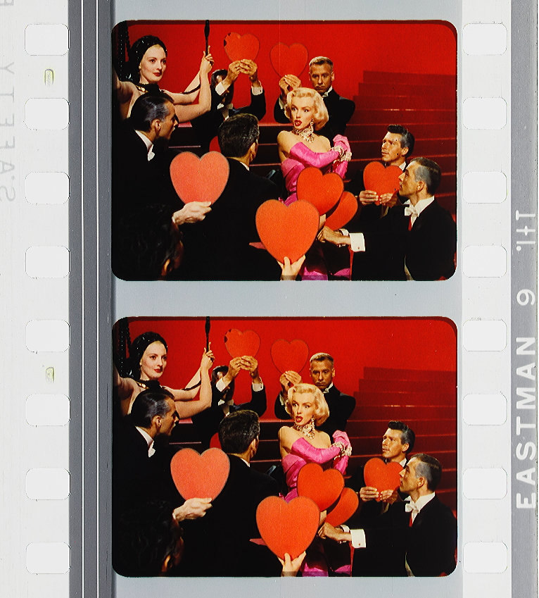
Three-strip Technicolor was the next advancement, and this one became the industry standard for decades. The artificiality here seems paradoxically “more real than real.”
Gentlemen Prefer Blondes (USA 1953, Howard Hawks)
A large number of other processes are detailed on the site, some experimental and abortive, others that sought to widen the market and make vivid color more affordable, like Agfacolor, which incorporated color-forming solutions in the film emulsion itself.
